YEAR 2- MACMILLAN COFFEE MORNING (UNIT 1)
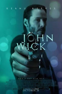 This is the poster of John Wick. As you can see the barrel of the gun replaces the
“O” of John Wick. The blue and purple halves show the contrasts within the
character’s story arc. They could also
represent the nightclubs within the film. He wears a suit which could represent
that he has money from what he does.
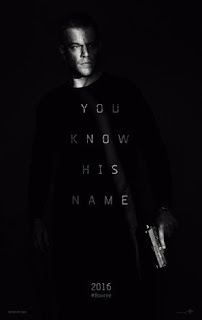 This is a
Jason Bourne poster. The majority of the poster is dark except one ray of light
which can show that Bourne is coming out of the shadows once again. The quote:
“You know his name”, symbolises that he had amnesia that made him forget who he
is and that everyone knows who he is through what he can do. The one ray of
light within the darkness could show that no matter how much he tries to leave
this life behind something always draws him back in.
He has a
gun but it’s at his side which could show he doesn’t NEED a gun to kill but
it’s easier and quicker.
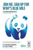 This is a WWF poster that shows their iconic panda logo. The logo is made out of the ocean which links to the event blue mile in which you swim, paddle and kayak for a mile to save the rivers & oceans. This happens on 4th September. They’ve substituted the black of the panda with the ocean. They’ve used the colour blue because people associate it with water.
The main difference between the Bourne, Wick and WWF poster is that Bourne/Wick have a sharper, deadlier tone than WWF. WWF has a friendly looking panda while John Wick has a gun pointed at your face and Bourne’s holding a gun at his side. WWF has a plain white background while Bourne and Wick have dark backgrounds.
What do we need to do?
We need to show what Macmillan is and what their purpose is. We will be researching poster logos, mood boards and styles to help us get ideas E.G: Chipp Kidd, Saul Bass and Shepard Fairey for how we will layout the Macmillan poster.
Here are a few examples of Chipp Kidd's Work:
 This is a drawing of Bat-Man by Chipp Kidd. This is one of Chip Kidd's work - he is a graphic designer and writer. He lived in Pennsylvania and graduated from Pennsylvania State University in 1986. Chip Kidd works on comic novels like: Batman: Death by design, The Bat-Man (in Bizarro comics)(2001), "The trust", in mythology: DC Comics and Batman with Robin the Boy Wonder (they're all short comic stories)
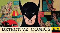
This is also another example of Chipp Kidd's comic work. This is advertising DC Comics by using one of their biggest characters... BAT-MAN. The colours used could represent emotions/mood i.e: Black-Fear/Death/Darkness, Red-Danger/(possibly)blood/emotions etc. Detective Comics is in bold, black letters because it's the name of the company and therefore has to stand-out against the rest of the image.
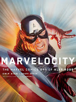 This is Chipp Kidd's drawing of Captain America and it has a similar style to the drawing he did that had Bat-Man in the middle with comics surrounding (picture just above). The title is called Marvelocity and Captain is in a "Warp Speed looking" background. Marvelocity is obviously the combined word of Marvel and Velocity which is probably why they've gone with a Warp Speed looking background.
I will be using these styles to create a Macmillan Advert Poster to raise awareness for cancer and the variations of cancer. I will use Photoshop to create a poster.
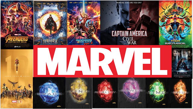 This is my mood board. This mood board contains what we like the most and mine is about marvel. More specifically it's about the M.C.U which stands for Marvel Cinematic Universe. The 6 relics in the bottom right are the infinity stones (each 1 can control an aspect of life- Space, Mind, Reality, Power, Time and Soul). They've slowly appeared in stages so it can build up the story easier- Tesseract(Space)(Cpt. America:1st Avenger)(2011)(Blue),Scepter(Mind)(The Avengers)(2012)(Yellow), Aether(Reality)(Thor 2:Dark World)(2013)(Red),Orb(Power)(G.O.T.G)(2014)(Purple), Eye Of Agomotto(Time)(2016)(Green) and the Soul Stone (on Vormir) (Soul)(2018)(Orange).
My target audience is for people who have suffered from cancer (patients/families/friends) this style will hopefully draw in comic fans and possibly college students. I will also try to use comics to help raise awareness for cancer. Their will be students, teachers, security and learning support assistants along with many more people.
Their will be coffee, cards, tops, merchandise, tea, hot chocolate, cake and live music at the coffee morning.
Our aim is to raise money for a charity called Macmillan Cancer Support.
We could have cut-outs of famous characters suffering with cancer:
Deadpool(Deadpool)
Walter White(Breaking Bad)
I think this is on a wall (can't remember). When people walk down the corridors their eyes might wander to the rest of the corridor to pass time.

This is on the inside of a disabled toilet. People can't ignore this when they're "busy".


This is on a window of the F block. People can walk past and take notice easier.

I can't remember where i put this but it's most likely in a corridor somewhere.

This is in Study Plus. This has multiple people who use the Study Plus area. This will be noticed by all the staff/students who use the Study Plus.
 This is on the door of a corridor. I've placed it here because people will see it while using the doors.
This is a JPEG version of the poster I made. I stuck them up at several locations such as a corridor, Study Plus, another corridor, F block and a disabled toilet.
This is a screenshot of within development.
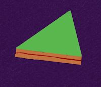
This is a screenshot within further development.

This is a screenshot even further within development.

This is the final design screenshot.
THIS IS THE 2ND DESIGN:


This is the red cup to represent coffee.
 This is what's going on and when.
This is my 2nd poster and segments of the poster for Macmillan Coffee Morning.
I have highlighted these segments because they have importance to the event. These are what holds the important information for the event. The Macmillan Coffee Morning was on the 28th September 2018. With this image I've used a cup and edited it by colouring it shades of red. The inner cup was shaded darker red to show that less light is on that area. I used a red paint tool within various shades. I also used an image of a cup for an accurate layout of what a cup looks like and also so it doesn't become un-proportional. I used a dark blue for text as their's a green background and you need the writing to contrast with the background to stand out. I chose a green background because that's Macmillan's primary colour.
This is the paint tool within Photoshop you use to paint colour.

This is the text tool within Photoshop you use to type.

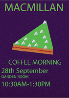
The font I used in my first poster(purple) is a Regular Myriad Pro at 98pt(97.86 to be exact) for the title.
I used the same font but this time it was at 60pt because it was for the sub-title not the title, of the first poster(purple). This is also the same size for time of event.
For the cake image I used white blobs as cream
 , I've made the inside of the cake visible as well
  and as you can see I've also drawn a jam line filling to make the cake appear more real.
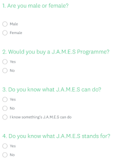
 1) Male
2) Yes
3) Yes
4) Yes
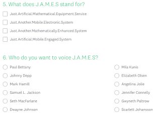
5) Just.Artificial.Mathematic.Equipment.Service
6)


Comments
Post a Comment